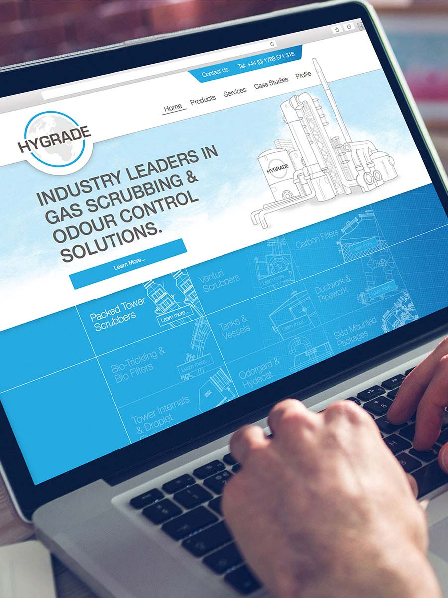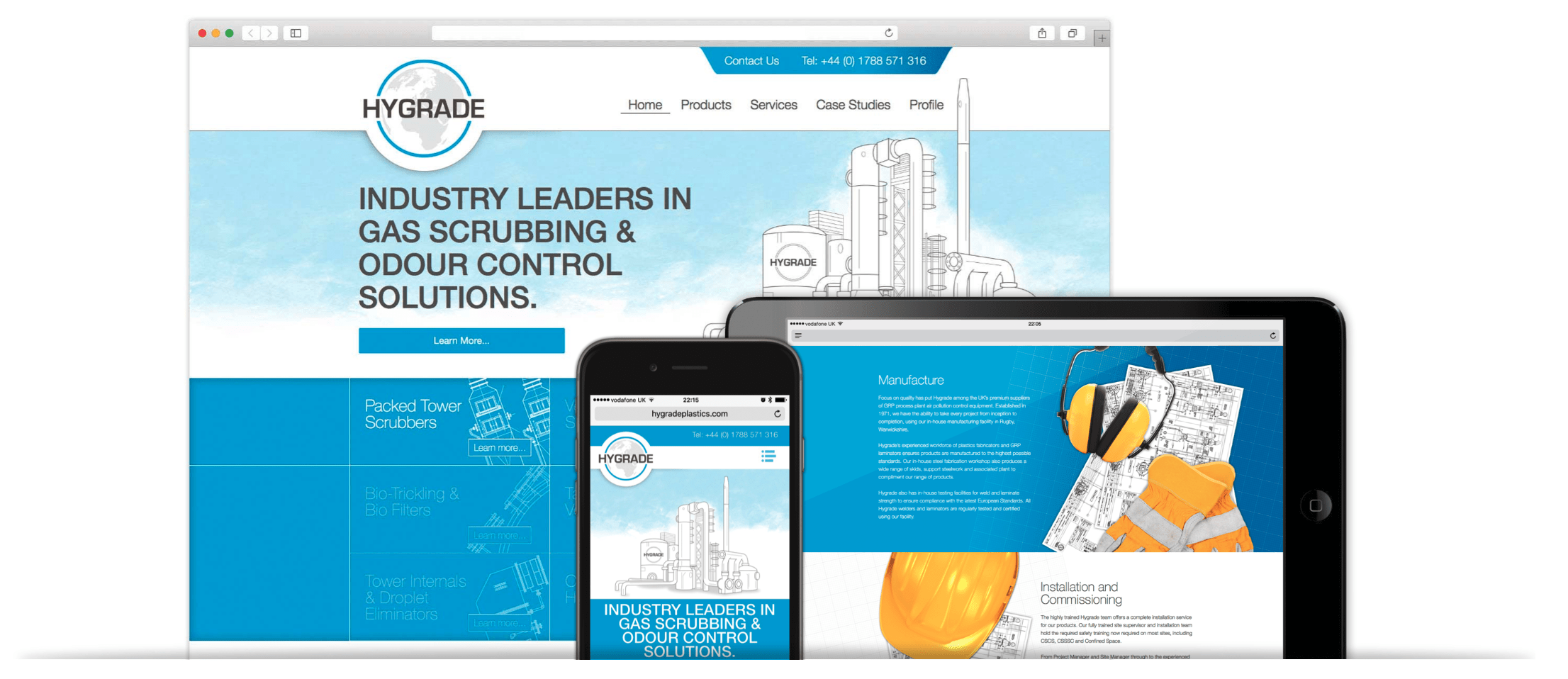


When Hygrade first approached us, their site was the antithesis of what a good site should be: it was very old, unresponsive and was misleading and unclear as to what they do. They therefore wanted to start from scratch to create a modern, responsive replacement that clearly presented who they are and what they do in an attractive and user-friendly way.

All modern website should be built responsively. It’s a crucial requirement now that mobile devices have become primary means for browsing the internet. As such, we build all of our websites responsively so they can be viewed on all and any screen size and aspect ratio. Users of our sites can access content with ease and won’t abandon your site due to an unpleasant user experience.

Hygrade provide an extremely specific item for very specific industries, yet this doesn’t mean that their website should be unintelligible to everyone except those familiar with what they do. We therefore met with the Hygrade team to learn about their complex business so that we could write about it coherently and present it to users in a simpler, more accessible manner.

This clarity is carried through the rest of the site via the use colour and layout. Bright blue sections, white space and custom graphics create a sense of space and light. Illustrations of technical drawings represent the technical aspect of the business in an engaging and attractive way, as does the subtle use of grid paper in the backgrounds of each product and service section.
Be in the know about the latest news, products, and exclusive offers! Sign up for our newsletter now and never miss out on the latest updates.
